


One of my favourite KPIs to follow on a ticket system in Smartsheet is the percentage of urgent requests. Knowing today's number is useful, but what you really want is a recent trend to give you an idea of the period you're in and the current focus that's required of your team.
We covered how to record daily KPIs in a previous article, and the percentage of urgent requests is a natural fit for that method. Tracked day by day, it looks like this:
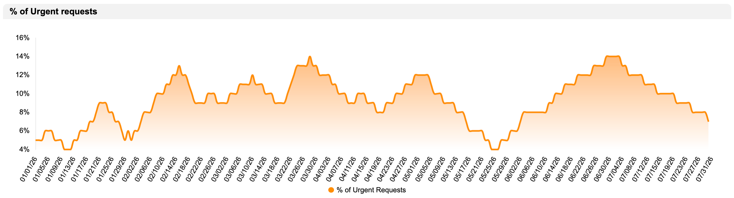
That view is best when you have a large amount of data to compare against the rest of the year, or against previous years. The catch is that you can only get it if you have already built the historical KPI automation described in that article.
If you have not, there is another method for getting a view of the recent trend. It still relies on some recording automation, but instead of a full year, it only looks at the last 60 days. That means it takes far less time to get a working trend chart, and you can even input a few values manually to get started quickly if you wish.
1. Record the date of urgent requests
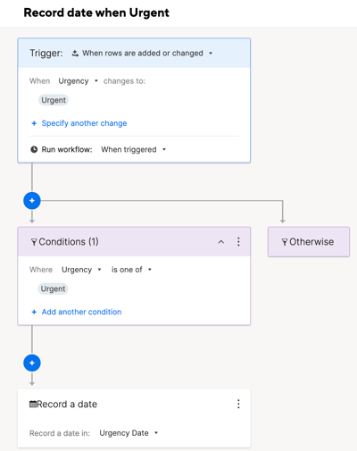
Build a Smartsheet automation that records the date whenever a new row is added, or an existing row is modified, with the "Urgent" field marked as such.
2. Create a metrics sheet
I recently wrote that reports tend to be the better choice for building charts. In this case, though, since we are gathering data tied to specific date ranges that will not change, a metrics sheet is the better tool. It gives you a fixed, reliable structure to point a chart widget at.
We need four rows and a single column for the percentage formulas.
Past 15 days:
=COUNTIFS({Project Intake Sheet Team #1-Urgency}, "Urgent", {Project Intake Sheet Team #1-Urgency Date}, >=TODAY(-15)) / COUNTIFS({Project Intake Sheet Team #1-Created date}, >=TODAY(-15))
Past 30 days:
=COUNTIFS({Project Intake Sheet Team #1-Urgency}, "Urgent", {Project Intake Sheet Team #1-Urgency Date}, >=TODAY(-30), {Project Intake Sheet Team #1-Urgency Date}, <TODAY(-15)) / COUNTIFS({Project Intake Sheet Team #1-Created date}, >=TODAY(-30), {Project Intake Sheet Team #1-Created date}, <TODAY(-15))
Past 45 days:
=COUNTIFS({Project Intake Sheet Team #1-Urgency}, "Urgent", {Project Intake Sheet Team #1-Urgency Date}, >=TODAY(-45), {Project Intake Sheet Team #1-Urgency Date}, <TODAY(-30)) / COUNTIFS({Project Intake Sheet Team #1-Created date}, >=TODAY(-45), {Project Intake Sheet Team #1-Created date}, <TODAY(-30))
Past 60 days:
=COUNTIFS({Project Intake Sheet Team #1-Urgency}, "Urgent", {Project Intake Sheet Team #1-Urgency Date}, >=TODAY(-60), {Project Intake Sheet Team #1-Urgency Date}, <TODAY(-45)) / COUNTIFS({Project Intake Sheet Team #1-Created date}, >=TODAY(-60), {Project Intake Sheet Team #1-Created date}, <TODAY(-45))
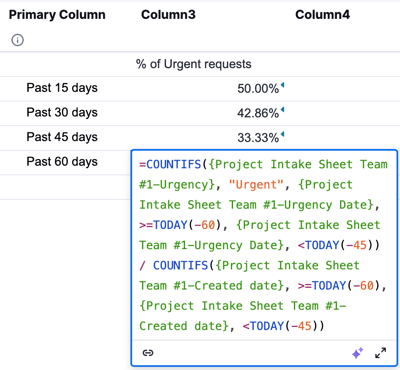
Each formula is made up of two COUNTIFS. You are counting how many urgent requests there are against the total number of requests for a specific period.
I know date-based formulas can look intimidating at first glance. Take the last one as an example: we are asking Smartsheet to count the requests that are ">=", meaning "greater than or equal to", a date that is "TODAY(-60)", 60 days in the past from today. That covers every request from 60 days ago onward. Adding the second criterion, "<TODAY(-45)", then narrows that down so we only keep requests from 60 days ago up to 45 days ago.
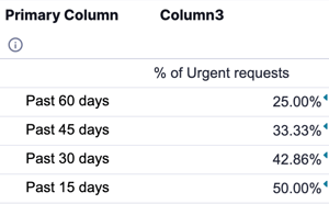
One detail to keep in mind: the order of your rows in the metrics sheet becomes the order of your data points in the chart, top to bottom on the sheet becomes left to right on the chart. I built mine in reverse the first time, so make sure yours reads oldest to newest, from top to bottom.
3. Add the chart to your dashboard
Finally, add a chart widget to your dashboard and point it at the metrics sheet you just built.
The result is a chart showing the trend of your urgent request percentage over the last 60 days, no full year of historical KPI recording required. You can instantly see if urgent requests are becoming more numerous or if you're getting less of them.
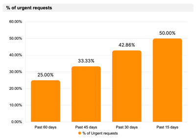
To have a full picture, since this is percentage widget, you can add an extra column in your metrics table to count the number of urgent request, that is the first part of your formula. This way you know if the number is evolving in value and percentage or if only one is going up.
If you would like help setting up urgency tracking, metrics sheets, or dashboards on your own Smartsheet instance, get in touch through the contact form and we can look at your setup together.
